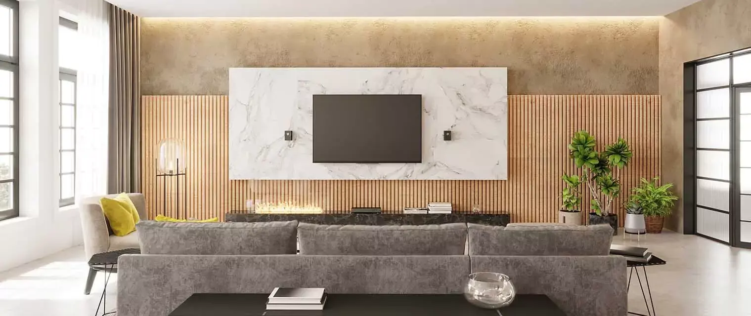
Color psychology assumes a huge role when it comes to interior design, especially in a place as vivid as Koramangala. How colors can affect the mood, perception, and overall feel can be harnessed or transformed into haven-like comfort and style. Following are 15 color psychology tips for elevating your interior design at home in Koramangala.
Blues that Calm for the Bedroom

Blue is soothing and calming, so it's the perfect color for a bedroom. It induces rest and serenity—what one would appropriate after a day of toil. Then, there are soft blues or even the deeper shades of navy hues that can help in creating a placid retreat in your Koramangala home.
Get Free Estimate - Price Calculator
Energizing Reds for Living Spaces

This color is energetic and able to energize a room. It triggers conversation and appetites; it's therefore great in living rooms and dining areas. Just use it with caution so that the space won't be overwhelmed by being on just one accent wall or even in art accent pieces.
Refreshing Greens for Kitchens

Green represents nature and renewal. It's great for kitchens, as it displays rejuvenation and health. Light greens will open up your kitchen for a breezy feel, and deeper ones will give the space a sophisticated feel.
Creative Yellows for Home Offices

According to our interior designers in Bangalore, yellow is the color of creativity and positivity. The creation of yellow in the home office invites productivity and thinking out of the box. Muted tones will bring about a balanced and work-conducive environment.
Elegant Grays for Living Rooms

Gray never goes out of fashion, and this is a versatile, timeless color that provides a very neutral background with which one can pair many colors. It makes any living room sophisticated and elegant in its own way. Combine different shades to add depth of interest into your Koramangala home interior design.
Cozy Browns for Libraries

Charming and inviting, brown is an ideal color for reading nooks or home libraries. It allows the atmosphere to become warm, relaxed, and focused. Deep chocolate browns or lighter wood tones can reflect this coziness.
Whites that Soothe: Bathrooms

White paint is associated with cleanliness and purity so bathrooms can benefit from it much. Also, it’s vital to observe that white paint gives an illusion that spaces are not only bigger, but brighter as well. It is now common knowledge that one should merely consider other decorating elements such as textured surfaces or wooden furniture in moderation when using white paint in order to avoid coldness and sterility.
Playful Pinks for Kids' Rooms

According to our best interior designers in Bangalore, pink presents an enjoyable experience as well as opportunities for fun making it an appropriate color scheme in children’s sleeping areas. The softer editions indicate mothering while the lighter versions enhance excitement in places where children reside.
Bold Blacks for Accents

Black is dramatic and modern, adding a feel of luxury to any interior. As an accent color, it brings in sophistication. Notice black furniture, fixtures, or any other decorative component of interiors for a bold statement.
Serene Purples for Meditation Spaces

Purple is the color of spirituality and luxury. A superb color for any meditation room or other space to be used for relaxation and introspection. Light lavender will soothe, and deeper purples will emanate richness and depth.
Energizing Oranges in Gyms

Orange is energetic and stimulating, thus making it an excellent color for gyms at home. The color is very energetic and promotes interest and fascination with whatever activity one is engaging their body in, thus keeping them active, focused, and able to sustain their workouts. Use it moderately since too much of this color may overwhelm the space.
Beige Neutrals in the Hallways

Beige is a very neutral color and goes great in transitional spaces like hallways. It gives off a warm feeling of invitation without overpowering any other elements. Beige-colored walls offer great versatility toward different styles of decoration, making it quite a flexible choice in home decoration for Koramangala.
Visit - Interior Design Projects
Harmonious Teals for Dining Rooms

Teal is the blue surrogate that calms and soothes, even as it energizes with the vibrancy of green. It's a balanced color that does its job in dining rooms exceptionally well by setting just the right atmosphere for family gatherings and meals.
Earth Tones to Ground Entryways

Earth tones are very grounding—think terracotta, ochre, sienna. This will make the entryway warm and inviting in your home by anchoring it to nature and making sure the impression which visitors get right from the beginning is one that won't be forgotten.
Metallic Colors to Bring Reflective Glamour

What exudes some glamor and luxury are gold, silver, and other metallic colors, which give a feel of adorning one's interiors. With reflective surfaces, spaces will look larger and more opulent in appeal. Use metallic accents on lighting, decor, and furniture to make your Koramangala interior design stand out.
WHY DECORPOT?
Decorpot has expertly designed over 8,250 homes, each showcasing a blend of creativity and practicality. Their extensive experience and innovative approach have made them one of the most sought-after interior designers in Koramangala, utilizing cutting-edge technology. Reach out to us today for bespoke interior design solutions tailored to perfectly fit your home. Contact Now!


.png)

.png)


 2026 | All Rights Reserved