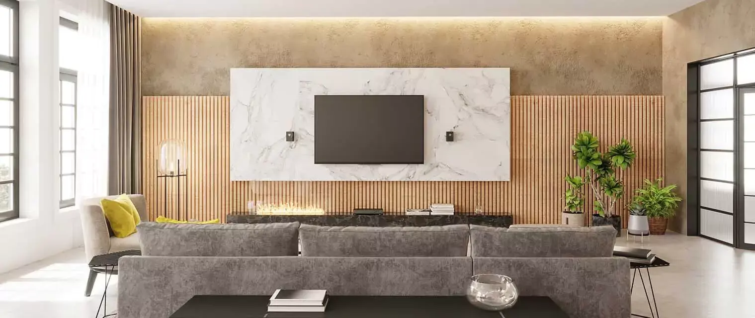
What is POP colour Combination for Roof?
In home design the roof contributes significantly to visual allure. One way to improve your roof’s appearance is by utilizing POP colours. This material is often applied in ceiling and roof designs for looks like texture; style adds as well. Choosing a POP colour combination for the roof means picking hues that blend well with the outside and inside of your house.
A well-chosen breather gives new life to a property while also being representative of its owner’s tastes. If you prefer neutral tones or bright colours, you can achieve harmony by mixing different shades so as to make it distinct from others and therefore having inclusive beauty on it.
Get Free Estimate - Price Calculator
15 Best POP Roof Colour Combinations
Classic White and Soft Blue:

A serene and soothing atmosphere is created by classic white with soft blue. Coastal homes or those looking for a fresh and clean design can work perfectly.
Elegant Grey and Charcoal:

Elegant gray can be paired with charcoal for a sophisticated and modern appearance. This is suitable for modern-day designs that are aimed at urban centers.
Warm Beige and Earthy Brown:

For this roof pop colour combination, a cozy and inviting feel characterizes the combination of warm beige and earthy brown. Such a pairing will fit well within the boundary designated for traditional designs as well as rustic homes.
Bold Red and Cream:

A bold red roof with a cream white wall would be an attention grabber indeed! It also gives rise to sameness in addition to colourfulness, hence making it great for introducing some drama into your property ’s character.
Rich Green and Ivory:

According to our interior designers in Coimbatore, the unity of the rich green roof on ivory provides an example of classiness with nature at its best especially in houses surrounded by flowers or trees.
Sky Blue and Sandy Beige:

For cool vibes, one should consider sky blue along sandy beige when decorating their home spaces. Therefore this choice would be appropriate for wearing casuals especially during summertime since they are so light according to the weight dictionary definition.
Muted Lavender And Grey:

On the other hand, gray mixed with muted lavender provides subtle sophistication, hence making such designs ideal. This type usually fits well with the artistic appearance advised under minimalism techniques used by some architects today.
Sunset Orange and Light Grey:

Nowadays, all around the world have become accustomed to people using sunset orange along with light gray because such combinations seem refreshingly brilliant as well as impressive at first glance.
Turquoise and White:

One may think that white colour always contributes to dullness but turquoise proves otherwise as it infuses life into faintly coloured surfaces. A perfect blend for parents who want their kids’ room not only to look bright but also colourful without creating chaos.
Maroon and Beige:

Indeed a rich luxurious sensation is achieved when maroon goes together with beige colour. These colours would fit perfectly in any traditional home design or even elegant in modern homes.
Teal Peach:

In order to achieve a witty taste of silliness combined with earnestness teal and light peach come off as contrasting hues. Therefore, this colour palette suits houses seeking playful and sophisticated means.
Slate Blue and Soft Gray:

Soft gray compliments slate blue evoking a calmness and serenity atmosphere which is ideal especially for peaceful families who prefer silence at night. This is a great roof pop colour combination.
Charcoal Gold:

These accents are used when you want something luxurious so as to make things look much more glamorous than ever before, therefore simplifying everything. It also enhances simplicity as high-end contemporary designs do.
Forest Green Cream:

Forest green together with cream creates natural landscapes and atmospheres in a house thus making them suitable for the environment around it.
Deep Purple Silver:

According to our interior designers in Thane, the deep purple organized with silver tones have dignified dramatic textures. Thus they embody extreme bravery in terms of bold expression.
Roof POP Design Colour Factors
In selecting the appropriate POP roofing colour mix, numerous elements should be taken into account so as to enhance your home’s beauty and fit in with your tastes. One important factor is architectural style; classic and muted colours are appropriate for traditional houses while more modern designs can use bolder colours.
The colours should match the natural environment surrounding it. Personal preferences are also very important since they help make sure that you pick up shades that go well together with your house architecture and occupy unique space in your heart .
There are colour assessment criteria for different climates and light situations; for example, lighter shades of paint work best in warm climates whereas darker ones imbue warmth in cooler regions. Fulfilling a desire to maintain uniformity in terms of finishes while achieving long-term resilience considerations also requires that exterior finishes and maintenance requirements form part of such decisions.
Check Out - Design Portfolio
Why Choose Decorpot?
In choosing the POP roof ideal colour mix, Decorpot is preeminent in its knowledge of interior designing. They create personalized designs according to specifications and also have vast backgrounds in both interior and exterior designing as well.
Using high quality materials and innovative approaches, Decorpot guarantees breathtaking and durable designs. They offer extensive services for smooth running of your project.
Conclusion
Selecting the appropriate POP colour schema for the rooftop has potential for improving the home's attitude and atmosphere. Due to the wide range of options existing, the appropriate combination of colours that would suit your personality and neighborhood may be found easily due to colourful palettes, which are suitable for every taste. The correct colours used either as conventional or daring pairings may lead to your home being changed totally thus creating a unified and attractive visual outcome.
Best results and professional assistance is offered at Decorpot. Get in touch now!


.png)

.png)


 2026 | All Rights Reserved