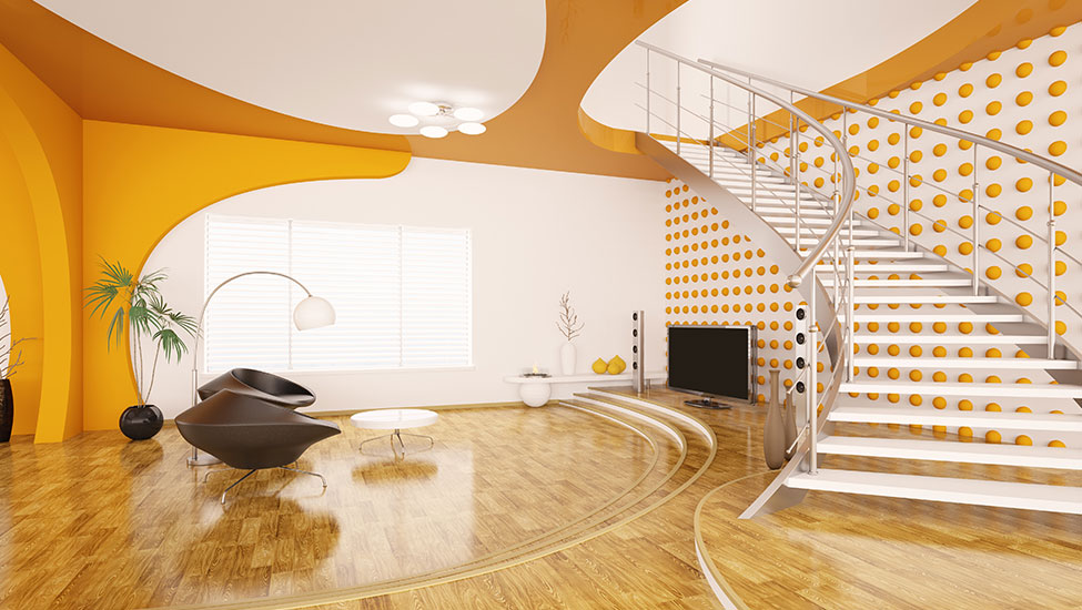
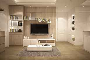
Contrast is an important element while planning the interiors of a place. Think of everything smooth and one concept throughout, feels boring, correct! Contrast is a technique of adding visual interest and a focal dimension in a place, the best way to break the monotony and boredom. Now the thing comes to the basis on which contrast must be played upon. Our best interior designers in Hyderabad say you can easily contrast and experiment on the basis of these 3 basic criteria-
1. COLOR
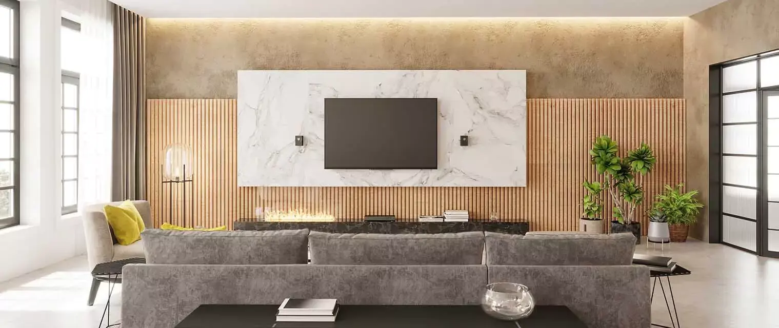
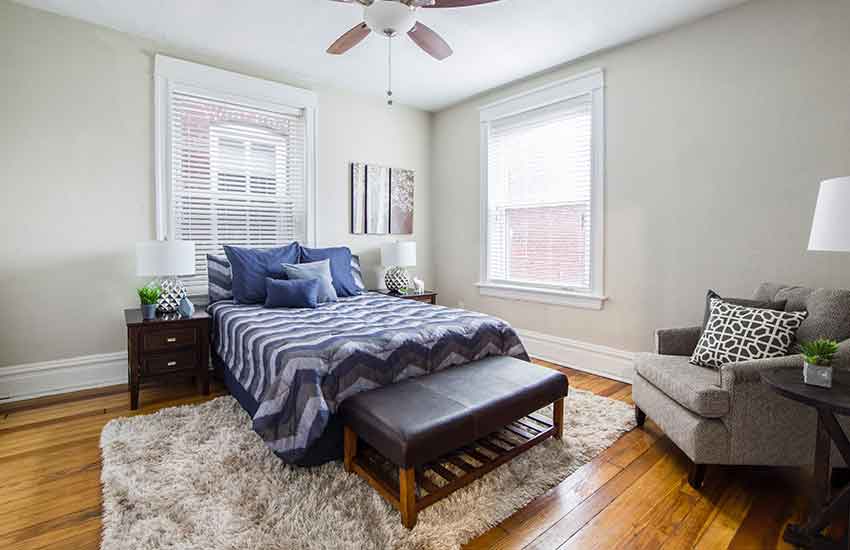
Color is the most eminent factor that is perceived widely and primarily by our visual senses. The first thing you get impressed with as soon as you step into a designer interior is the color. When it comes to contrast is color, we all know a combination of white and black stands a pillar. Any color, when used in pair with white or black, will also stand out as a good contrast (just as in the above image). Other than this any match of light and deep tones do the job! (look at the below image with light stone grey walls and Prussian blue bed covers). Another good way of contrast is to opt for a light and a dark shade of the same color while choosing for home interiors.
2. SHAPE
The contrasting parameters in shape fall under the classification of geometric and organic. Where geometric shapes refer to circle, square, rectangle, etc., organic shapes are natural-looking shapes, a distorted edge illusion of the geometric shapes. The geometric shape really helps to neat up the interiors and make them look sophisticated while the organic shapes add a touch of comfort and casualty and smoothen up the complete finish. When both these shapes are thoughtfully blended in the same place, it marks a marvel of interior design.
3. TEXTURE & PATTERN
These two elements of interior design have a significant role to bring up the contrast in a space, you can think of the first as a multi-dimensional version of the second. Considering texture, think how different it feels to swirl your hand on the plain wall of the above bedroom and then to touch the window blinds with horizontal stripes. Laying a textured element over a plain base adds oomph into the interiors (see how textured lamps placed on the side tables of the bed are doing their magic). Texture can also be incorporated and experimented with in terms of materials. Vision how different the materials of a rug, bedcover and side chair in the above picture will feel. The texture really helps to keep your sense of touch perceptive to the contrast going on in the interiors.
Patterns are formed with a recurring and repetitive design form (this design form can be organic, floral or geometric). The easiest way of imbibing patterns is to use them in homedecor materials and change the outlook of interiors as and when you feel. A trending way of using bed linen and pillow covers with contrasts can be a good option to start with.
Using contrast in a well balanced and thoughtful way is always an indication of a great design style floating through the interiors of a home. Planning your interiors with experienced design experts is thus important.
For any interior design requirement in Bangalore, you can reach our team of professionals through www.decorpot.com

.png)

.png)

 2026 | All Rights Reserved